
Arlington/Northern VA Residents, Animal Shelters, Animal Community Services
Visual Design, User Testing, Rapid Prototyping, Layout, Wireframing
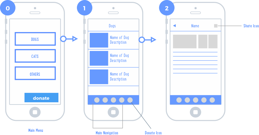
I started the process by reviewing the current flow of the app with our Creative Director and Project Manager. We wanted to keep the core functionality of the existing app the same with a few minor tweaks to the navigation structure.
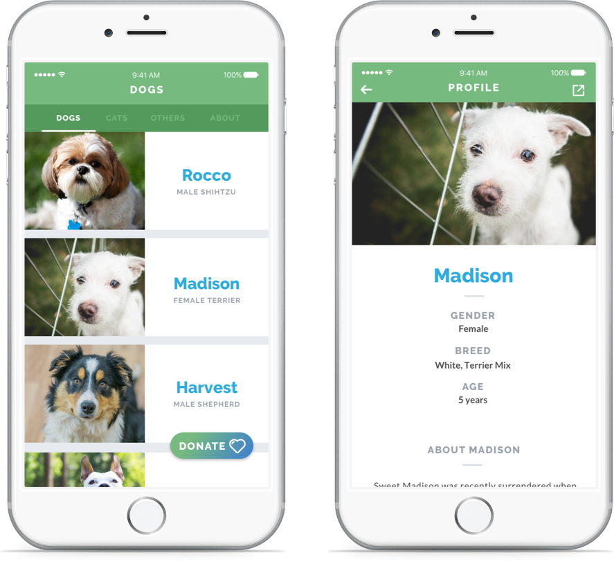
We proposed removing the main menu screen so users would be taken directly to the adoption screen, and moving the adoption navigation to the top. We proposed making the donate button more prominent and sticky as the users scrolled through the list of animals available for adoption. We also suggested moving the call and email buttons to the end of the profile page.
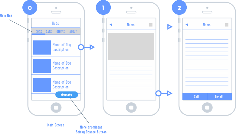
Testing revealed that users were struggling to locate the donate button in the previous navigation structure, so we moved the navigation to the top and removed the icons. Leaving the donate button at the bottom and keeping it visible at all times made it more prominent and always available.
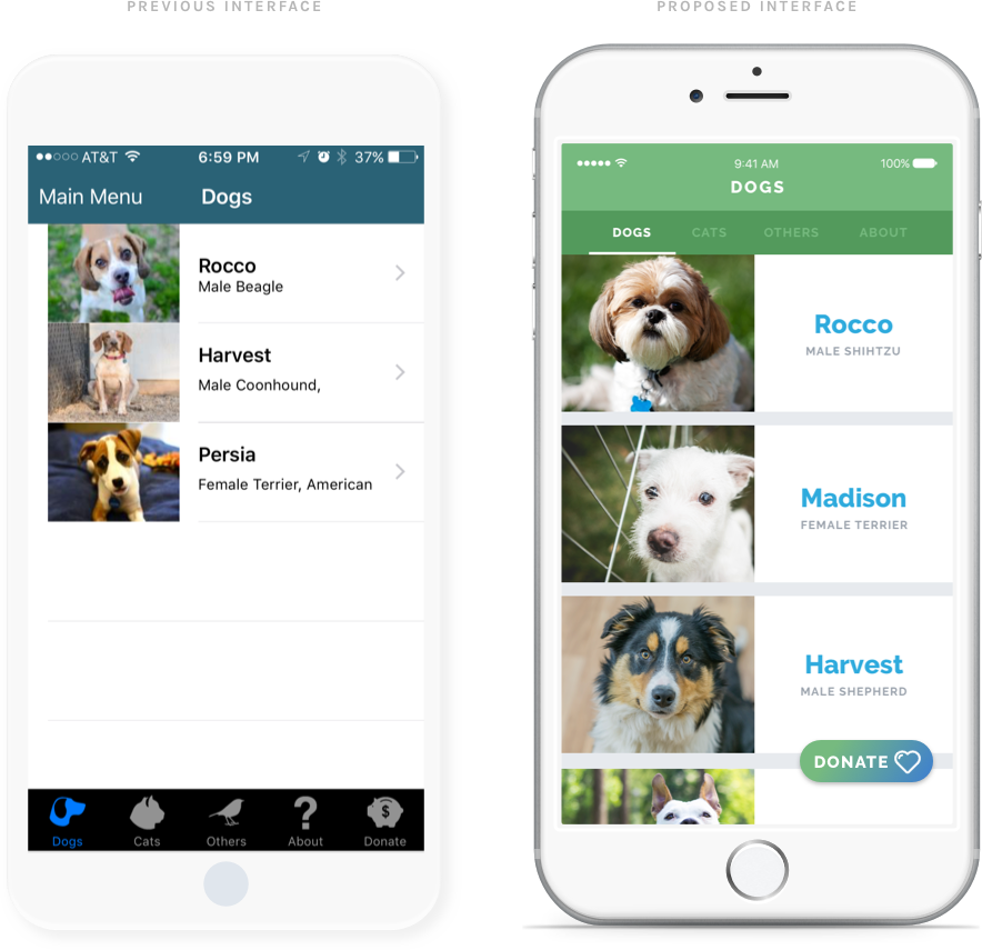
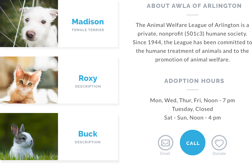
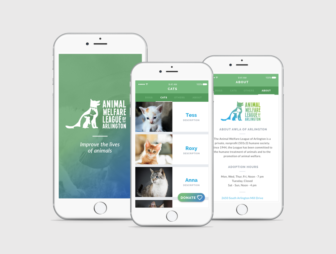
On the initial screen, users can choose from dogs, cats, and other animals that are available for adoption. Once the user finds an animal they like, they can choose to review a detailed description that includes its personality and exercise needs.
I chose to do high-fidelity prototypes directly in Sketch, which allowed me to create new design patterns more quickly. I then uploaded them to Marvel to create an interactive flow with realistic transitions between screens. Below is a sample prototype directly from the Marvel app.