Schools, Non-Profits, Local Shops and Businesses, Local Business Owners
Visual Design, Illustration, Wireframing, Branding
The project started off with brainstorming Sidewalks’ identity. Our client had a few ideas they wanted to focus on, so I sketched out some ways to express them. They really liked the apple combined with the local community theme, so I decided to combine the apple with a building for the final Sidewalks logo sketches.
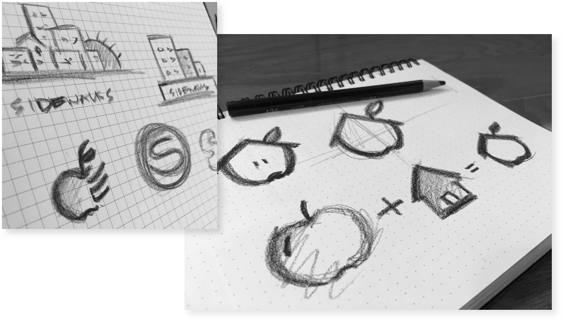
I refined the logo sketches and then redrew them as vectors in Adobe Illustrator. Once the final logo was approved, we were able to start the moodboard process for Sidewalks’ branding and overall usage guide for web, mobile, and marketing materials.
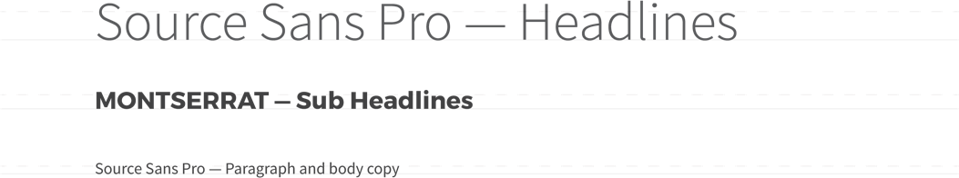
I wanted to choose typefaces that were friendly/approachable to help make their identity inviting to a wide range of audiences.

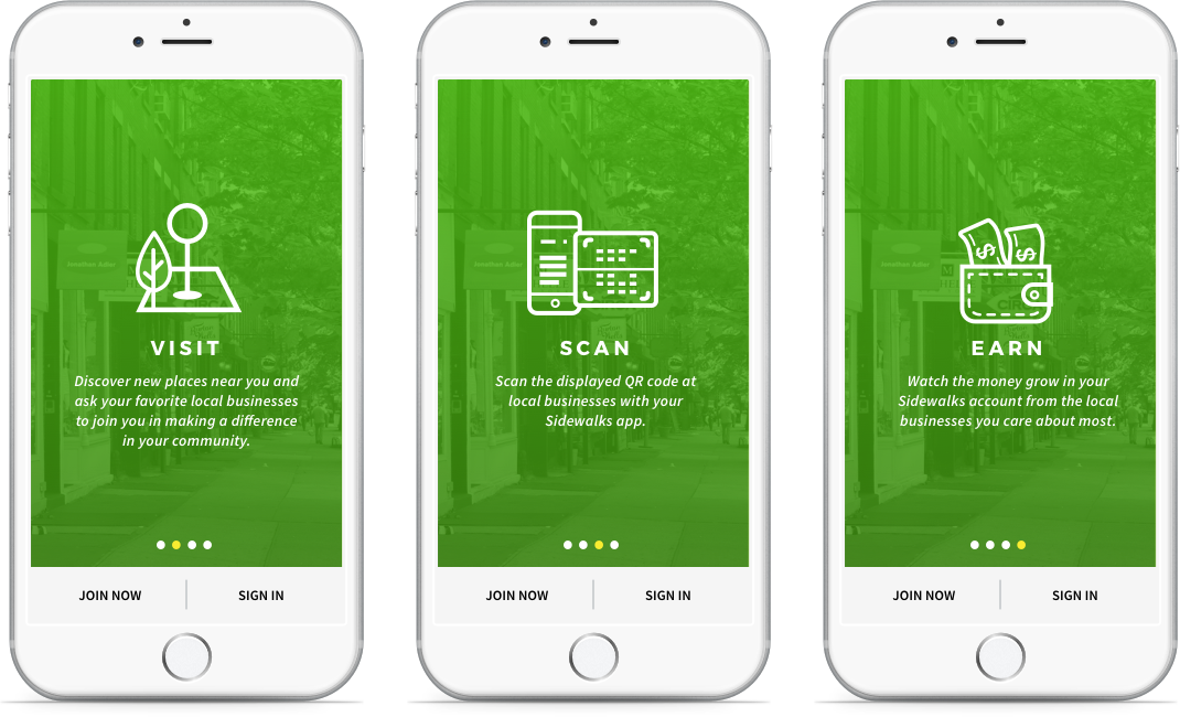
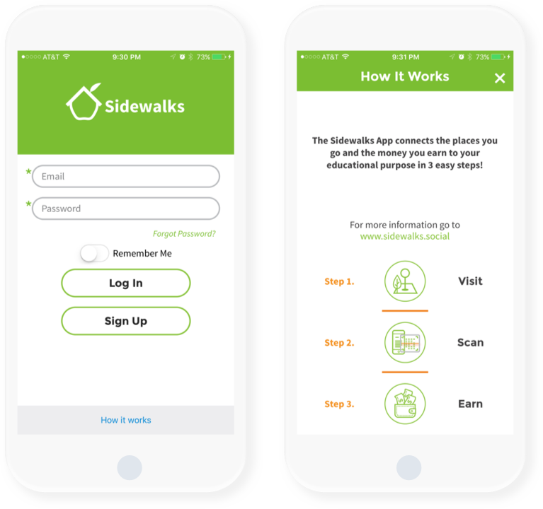
The previous sign-in layout featured a “how it works” link at the bottom of the screen. While we were able to consolidate the information on how the app works on one screen, I thought it might be nice to try a simple benefits onboarding flow with a short description for each step.
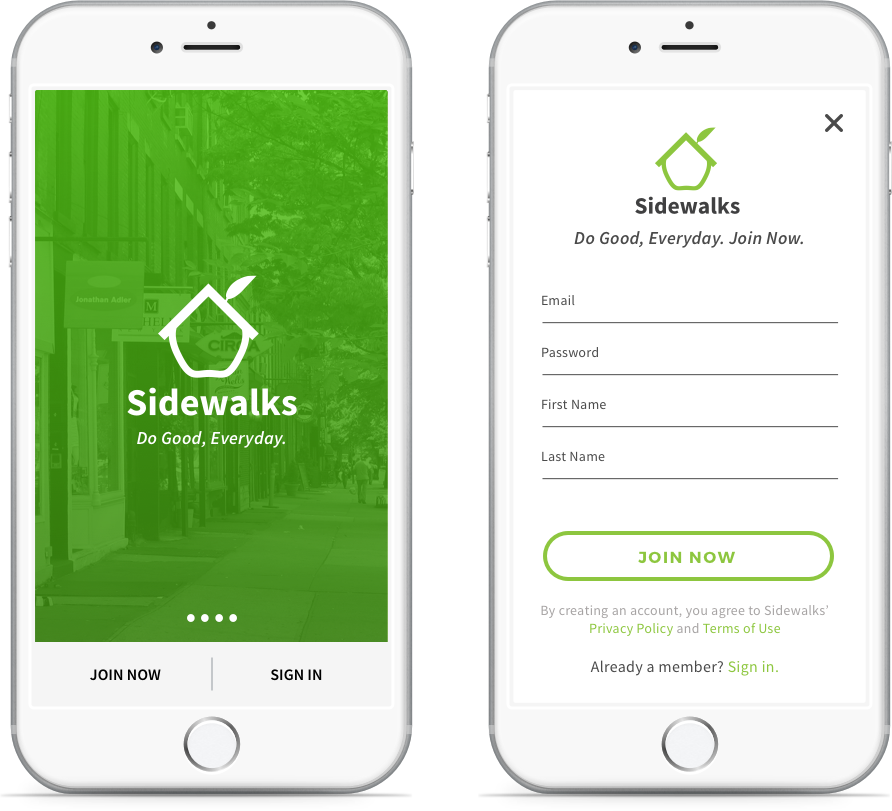
I wanted to keep Sidewalks' bright green as the main focus of their brand while introducing icons and other pops of color when needed. I kept the join now and sign in options on the home screen, but moved them to the bottom. I then added swipe buttons to alert users that there is more to see, and to enable them to view the onboarding / walkthrough screens.
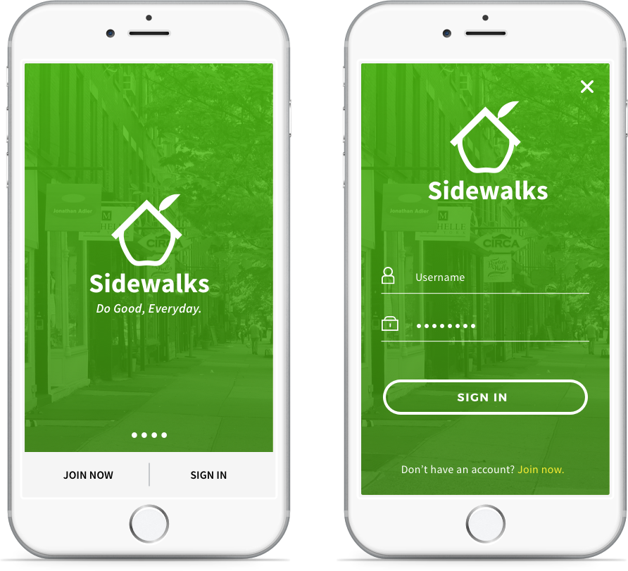
Instead of combining all three steps on how the app works into one screen, why not place each step onto its own screen with a short description so that users can learn more about it? On each screen, the user can join or sign in if they already have an existing account.